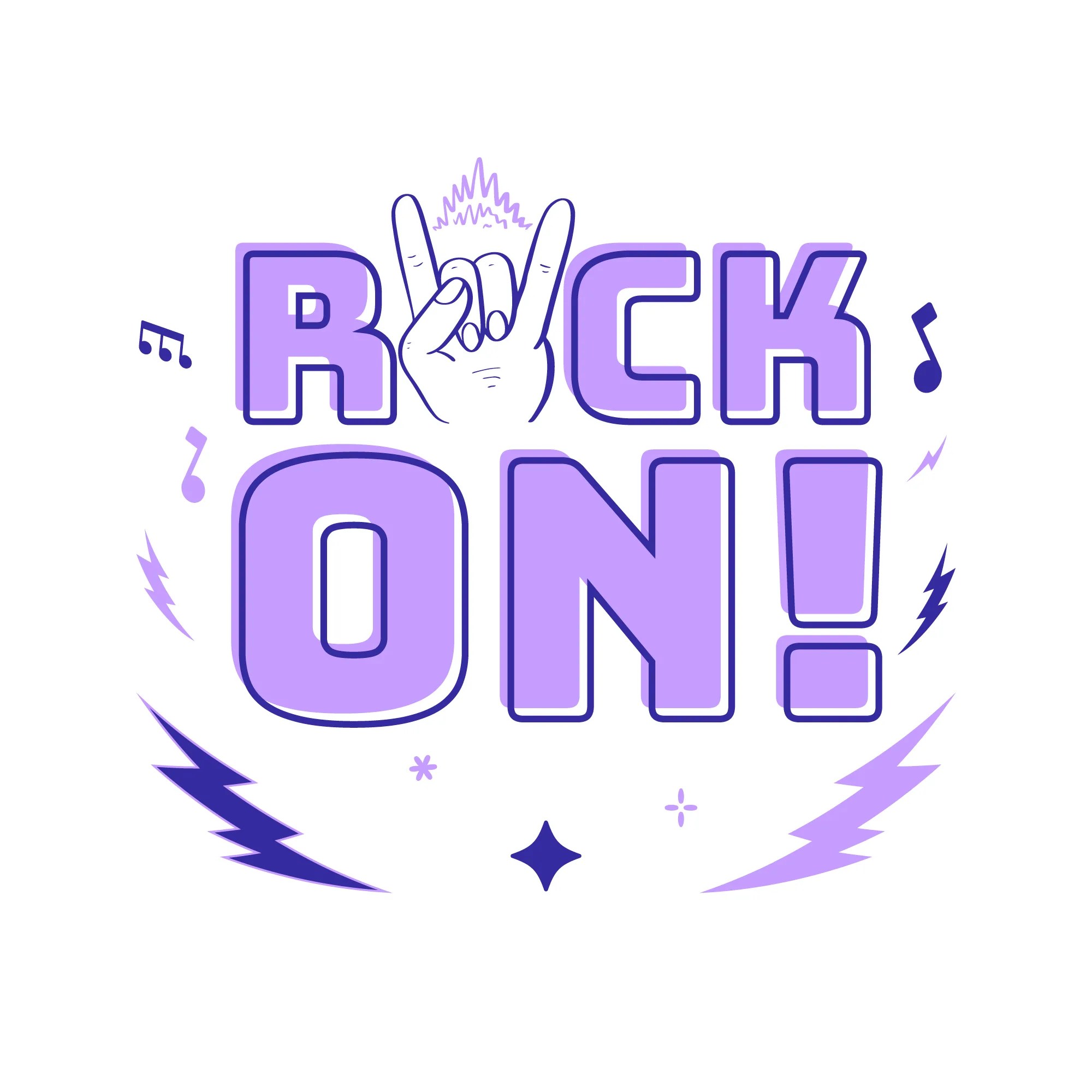
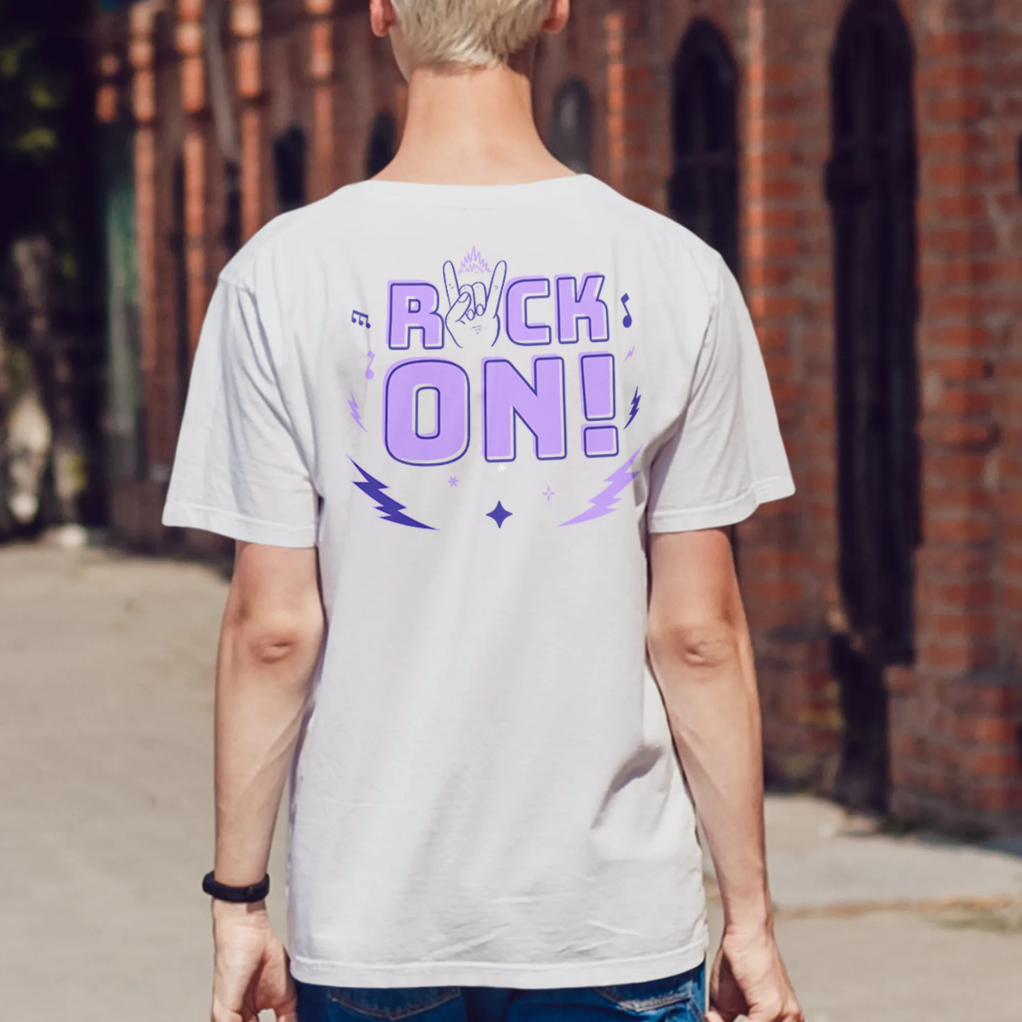
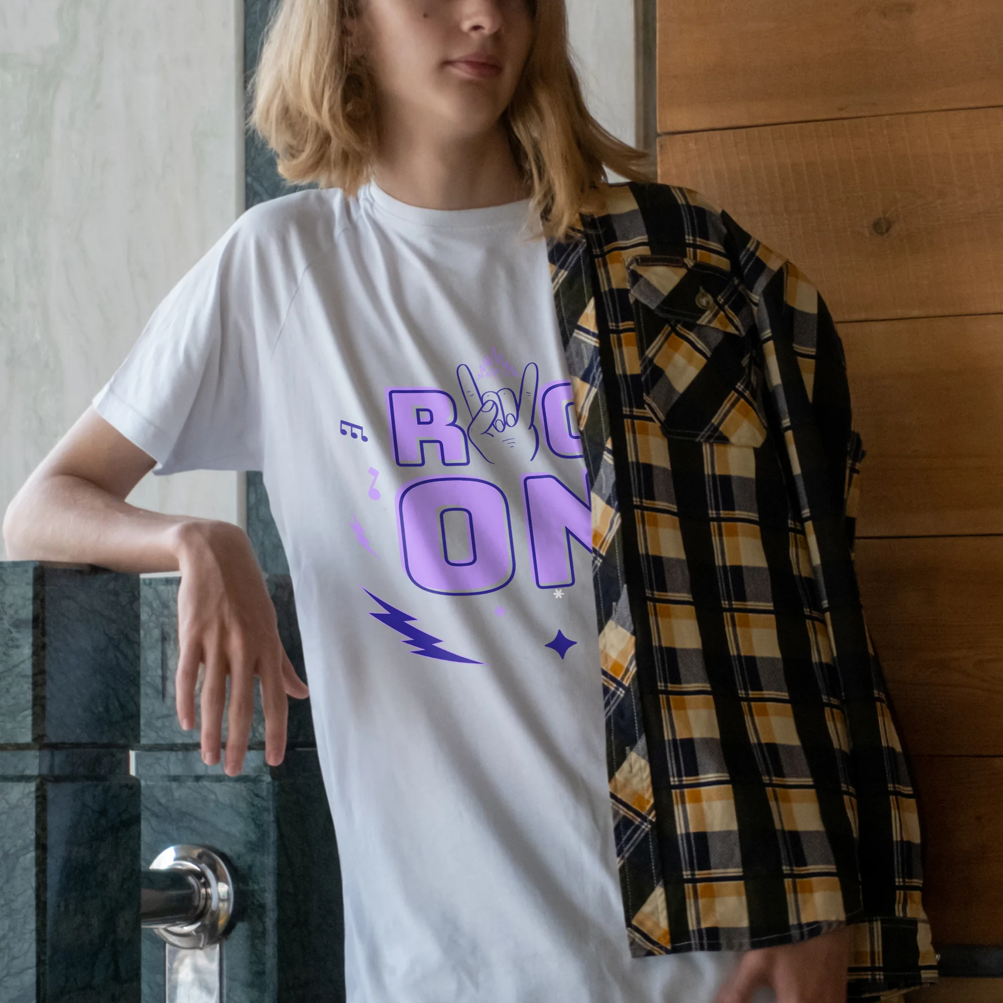
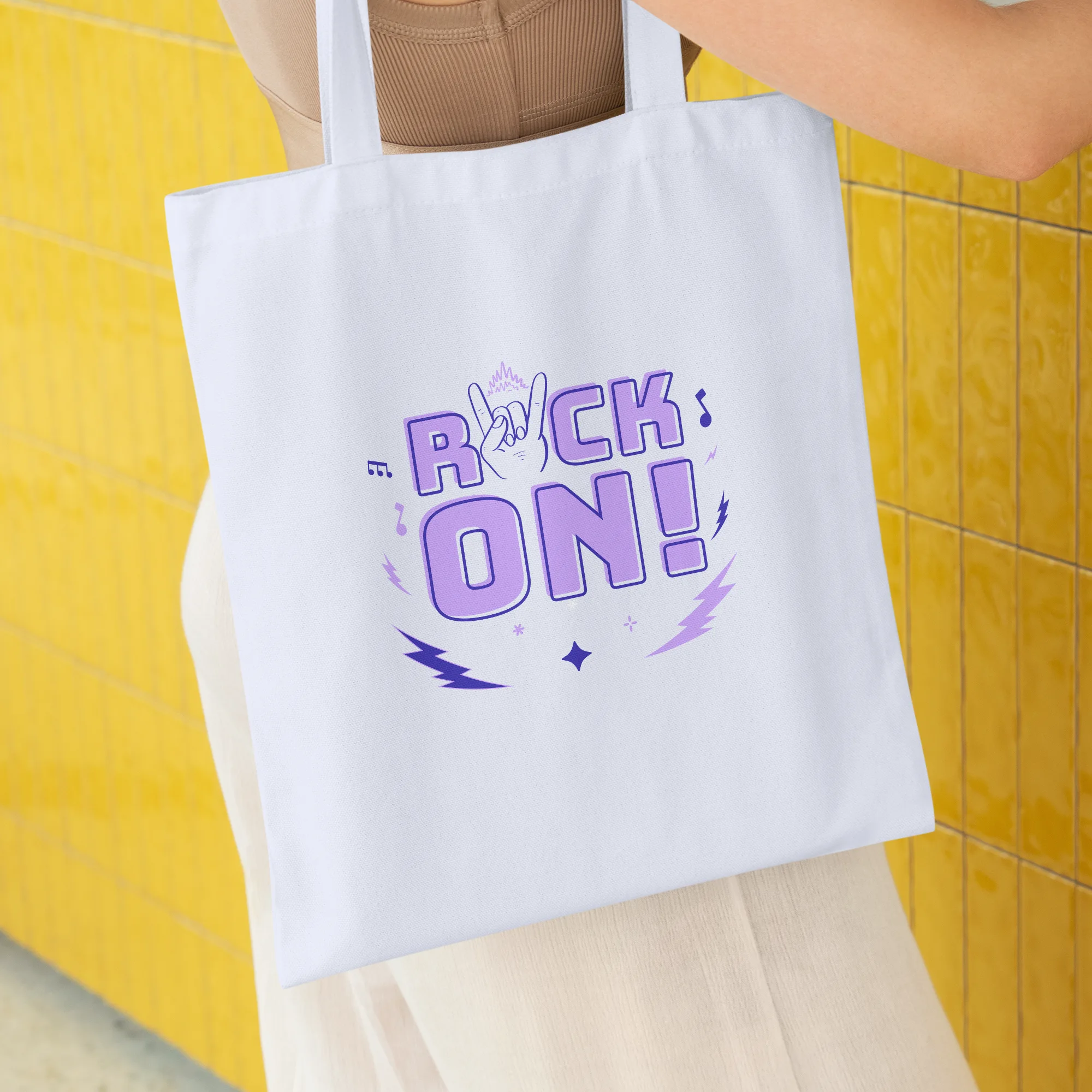
The design features a main object which is a phrase that says “Rock on!” written in a bold and eye-catching typography. This phrase is accompanied by a hand gesture known as the Maloik, commonly associated with rock music and heavy metal culture. The hand is illustrated in a aesthetic style, with detailed linework and shading to create a visually striking image.
The design also incorporates lightning bolts, adding a dynamic and energetic element to the overall composition. The lightning bolts are designed to complement the aesthetic style of the illustration, with bold and sharp lines.
The overall style of the design is aimed at capturing the essence of rock music and its rebellious and expressive nature. It is targeted towards teenagers and musicians, appealing to their love for music and the freedom it represents.
The color scheme for this design is dominated by violet, a bold and vibrant shade that adds a sense of mystery and creativity. The use of violet helps to create a visually captivating design that stands out and catches the viewer’s attention.
For the text, a sans serif font is used to maintain a clean and modern look. The typography is bold and well-defined, ensuring that the phrase “Rock on!” is easily readable and impactful.
Overall, this design combines aesthetic illustration, bold typography, and vibrant colors to create a visually captivating and energetic representation of rock music and its rebellious spirit.
