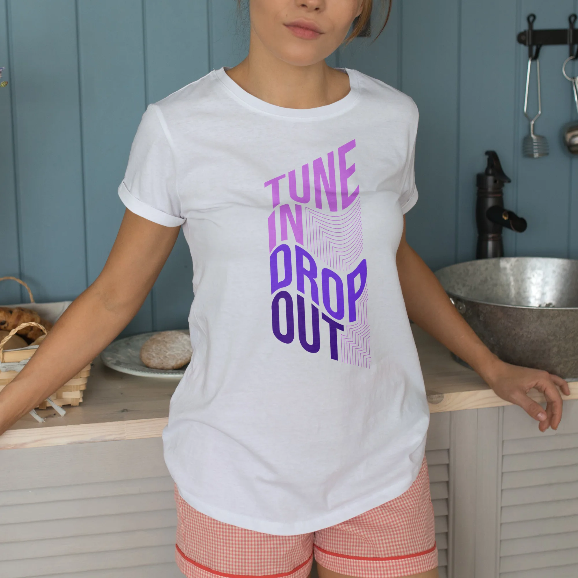
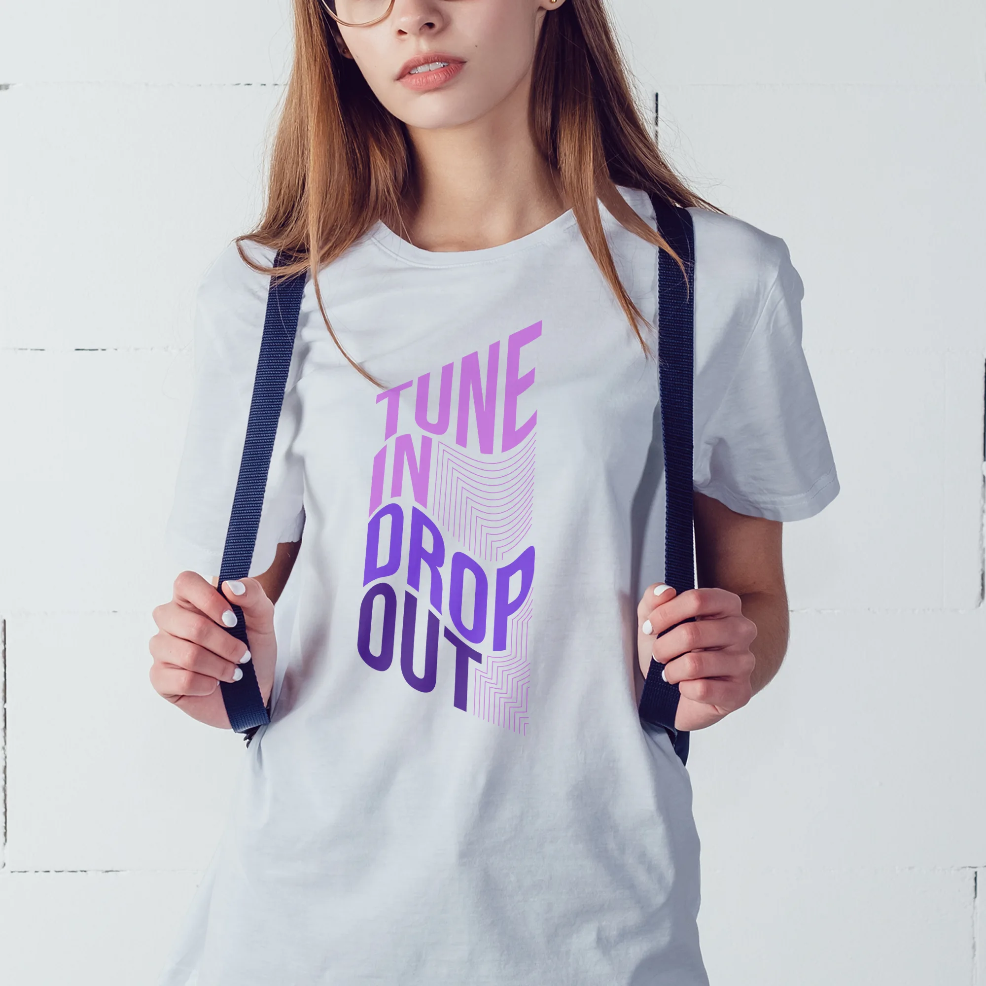
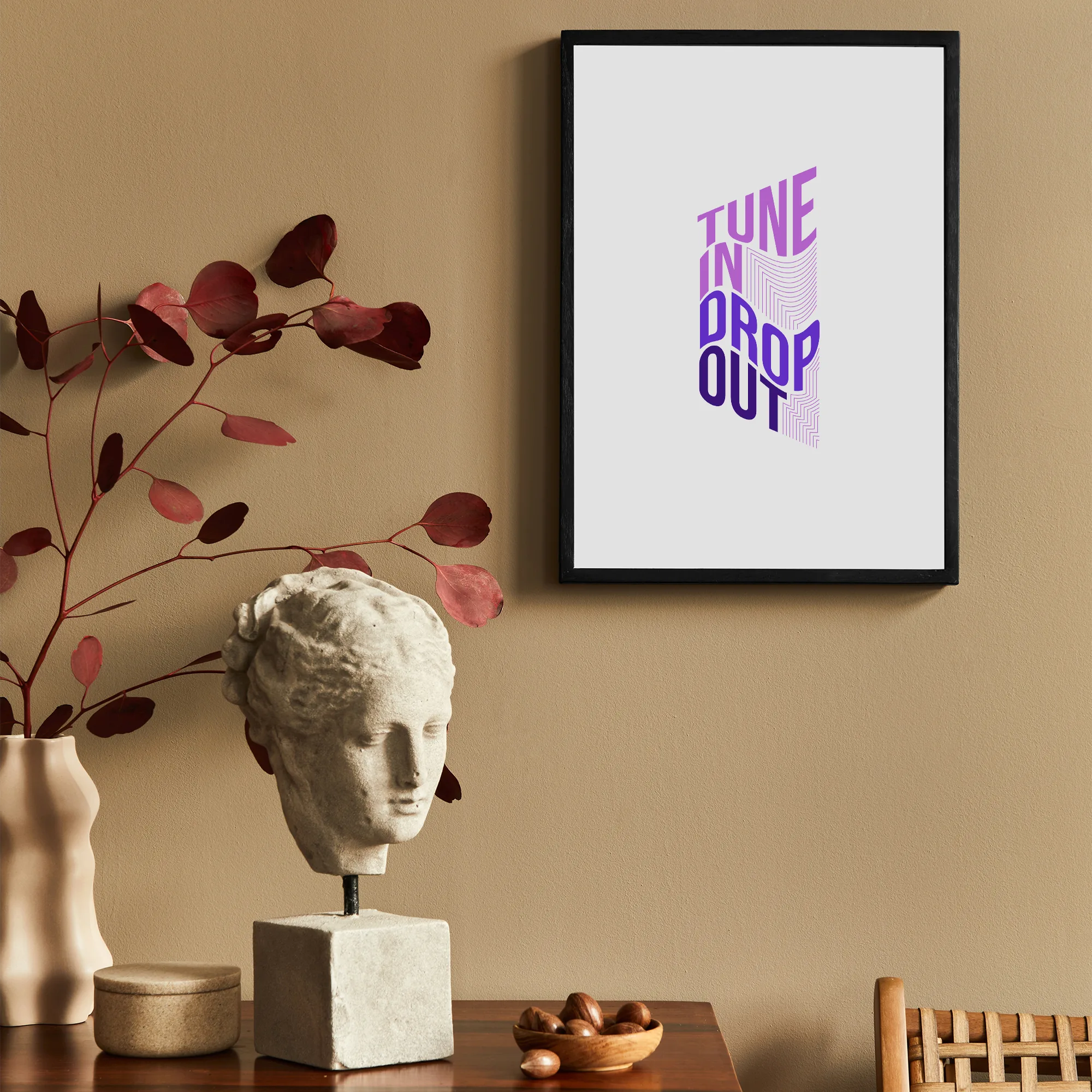
The design features a main object that takes center stage, which is a musical phrase with a distorted perspective. The musical phrase is visually captivating and adds an artistic touch to the overall composition. Accompanying the main object are lines that complement the design, adding depth and movement.
The design is inspired by various styles, including aesthetic, boy, children, girl, kids, line, music, musician, quote, simple, teenager, and typography. These elements come together to create a visually appealing and versatile design that can appeal to a wide range of audiences.
The color scheme of the design primarily revolves around shades of purple, pink, and violet. These colors add a sense of vibrancy, playfulness, and creativity to the overall composition. They also contribute to the design’s ability to capture attention and evoke emotions.
The fonts used in the design are bold and display typefaces. These fonts enhance the visibility of the text and make it stand out within the overall composition. The use of bold fonts adds a sense of confidence and assertiveness to the design, while the display fonts add a touch of uniqueness and creativity.
The text featured in the design is “Tune in drop out.” This quote adds a sense of rebellion, individuality, and freedom to the overall composition. It encourages the viewer to embrace their own unique musical journey and to break free from societal norms.
Overall, this design incorporates various elements to create a visually captivating and versatile composition. It combines a distorted perspective musical phrase, complementing lines, a range of styles, a vibrant color scheme, distinct fonts, and a thought-provoking quote to create a design that appeals to individuals of different ages and tastes.

