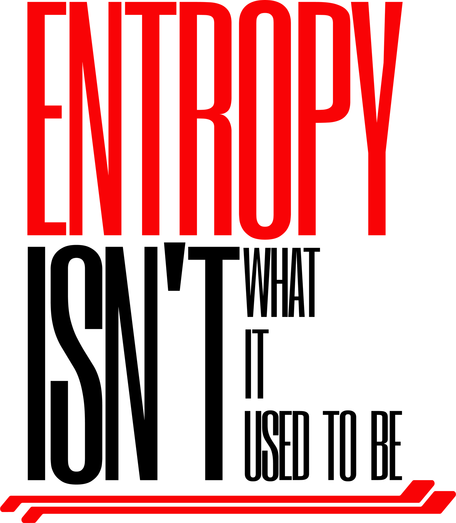
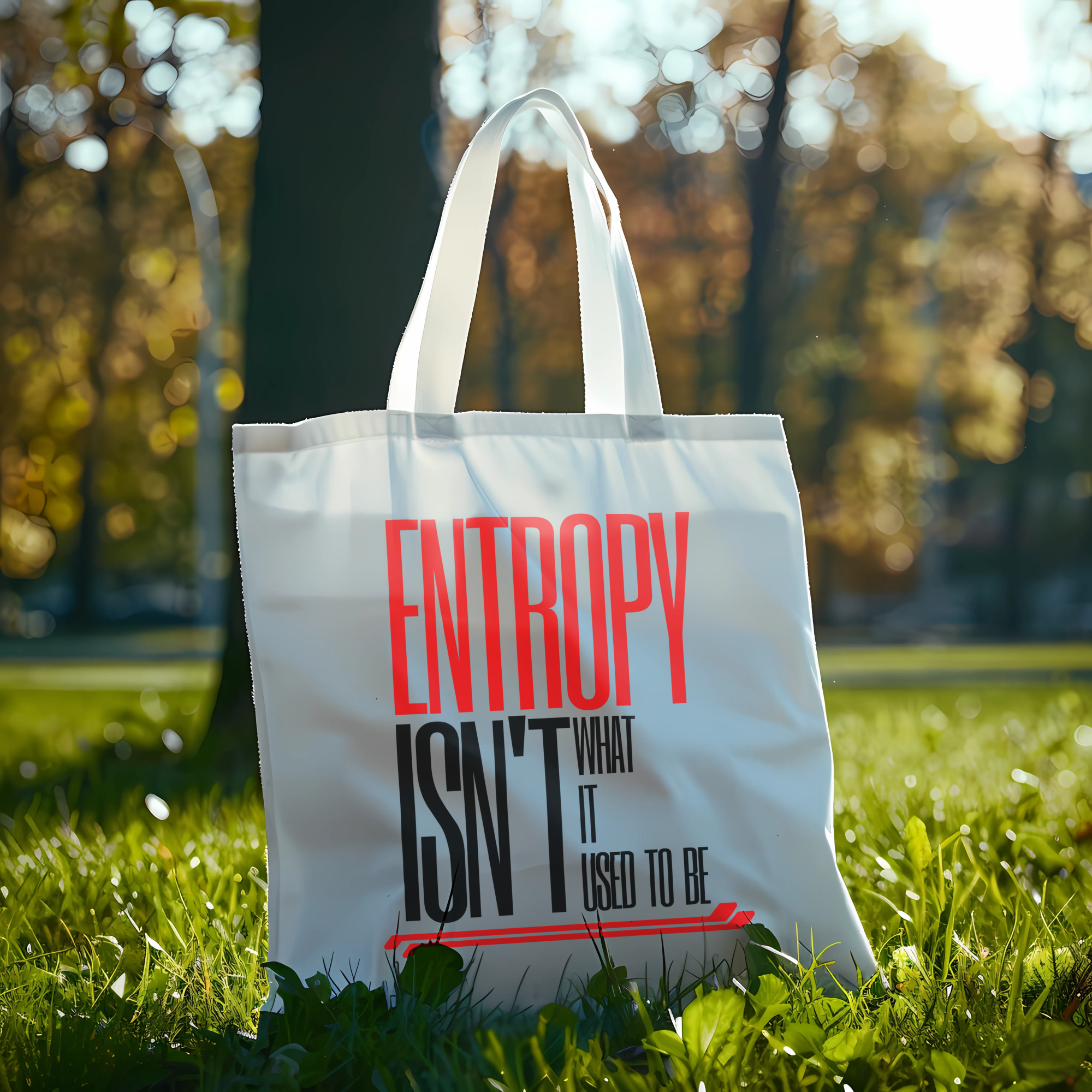
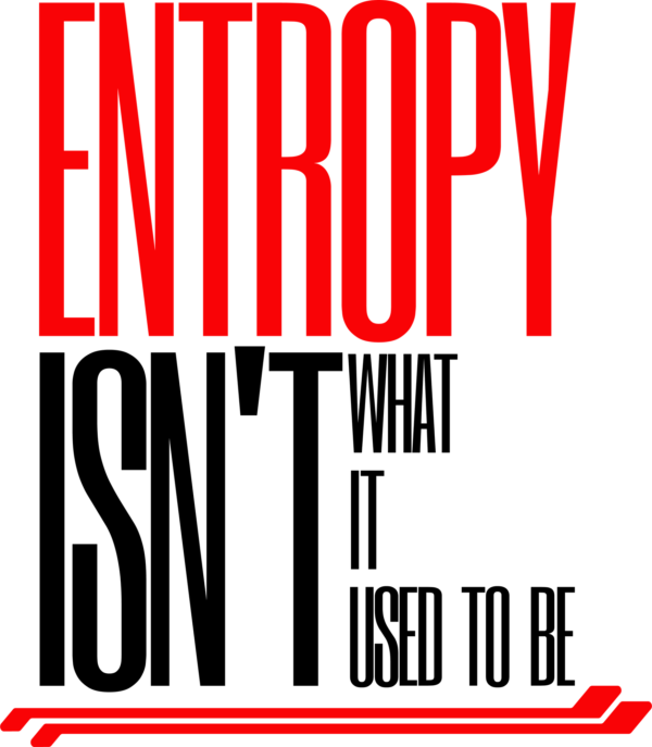
The design features a bold typographic composition in a display font, showcasing the science phrase “Entropy isn’t what it used to be” in a vertical layout. The text is rendered in a striking combination of red and black, with a 3D effect adding depth to the design. Small red lines at the bottom of the composition add a touch of visual interest. This design combines elements of typography, quote, and black style to create a dynamic and eye-catching piece.
Entropy isn’t what it used to be
The design features a bold typographic composition in a display font, showcasing the science phrase "Entropy isn't what it used to be" in a vertical layout. The text is rendered in a striking combination of red and black, with a 3D effect adding depth to the design. Small red lines at the bottom of the composition add a touch of visual interest. This design combines elements of typography, quote, and black style to create a dynamic and eye-catching piece.
SKU:
SKU-33220-2a11da4581b3801a09326efe6cf2af23
Categories: aesthetic, black, quote, Science Designs, typography
