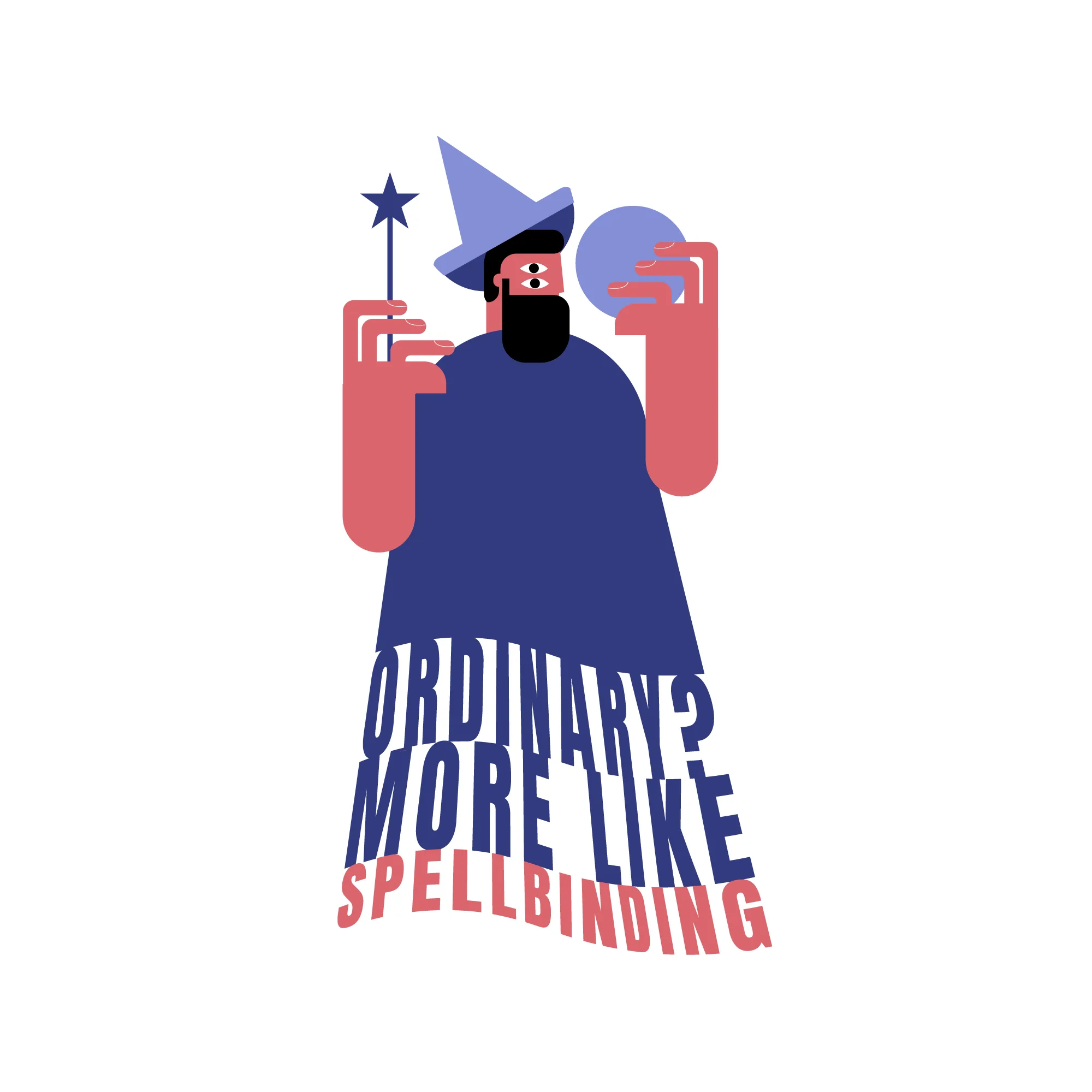
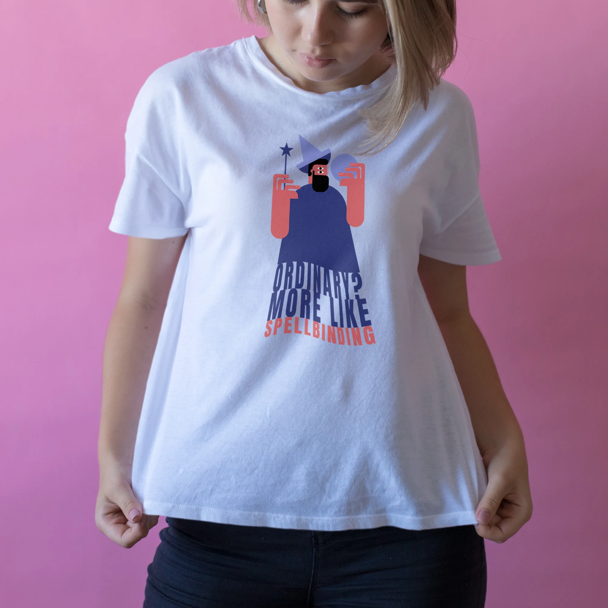
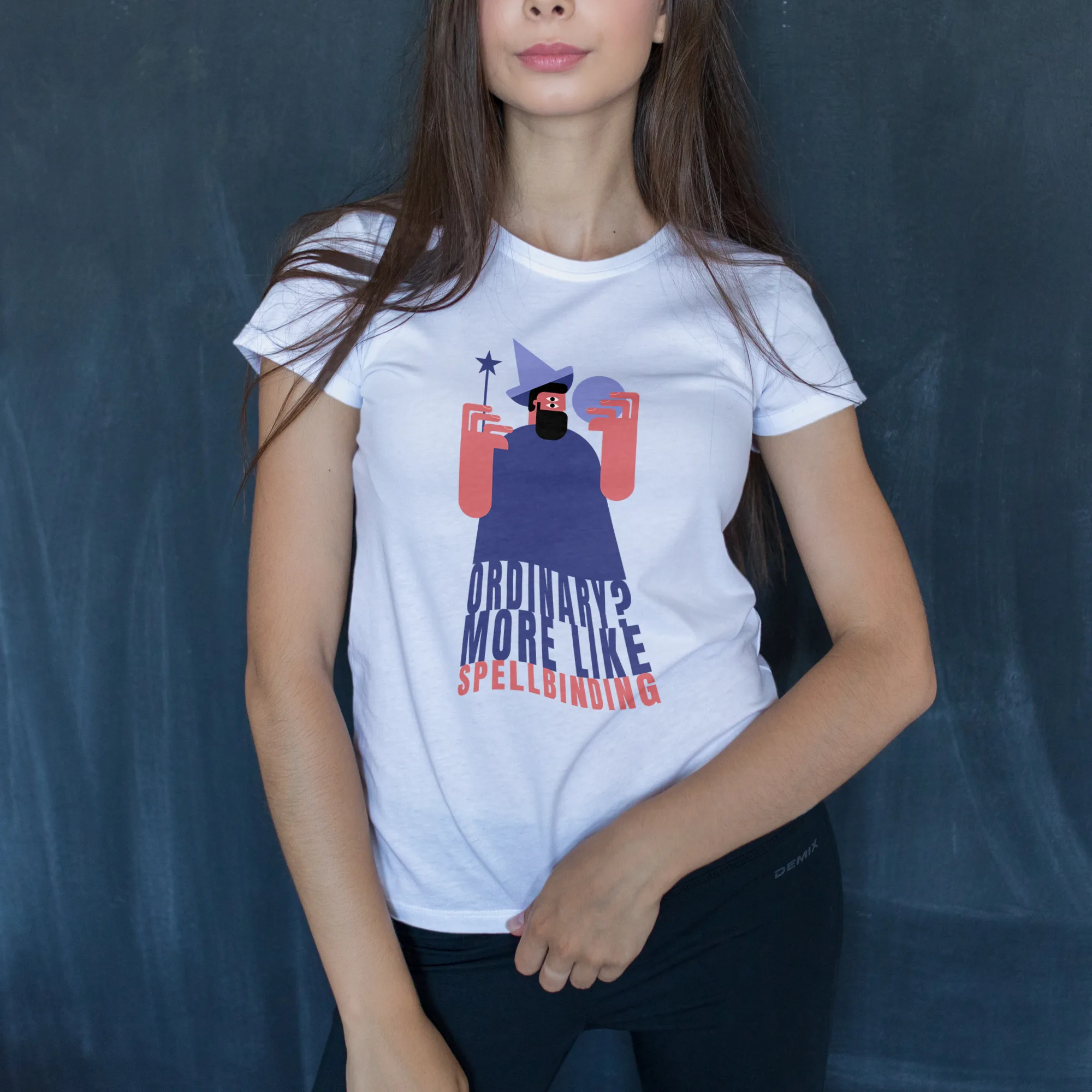
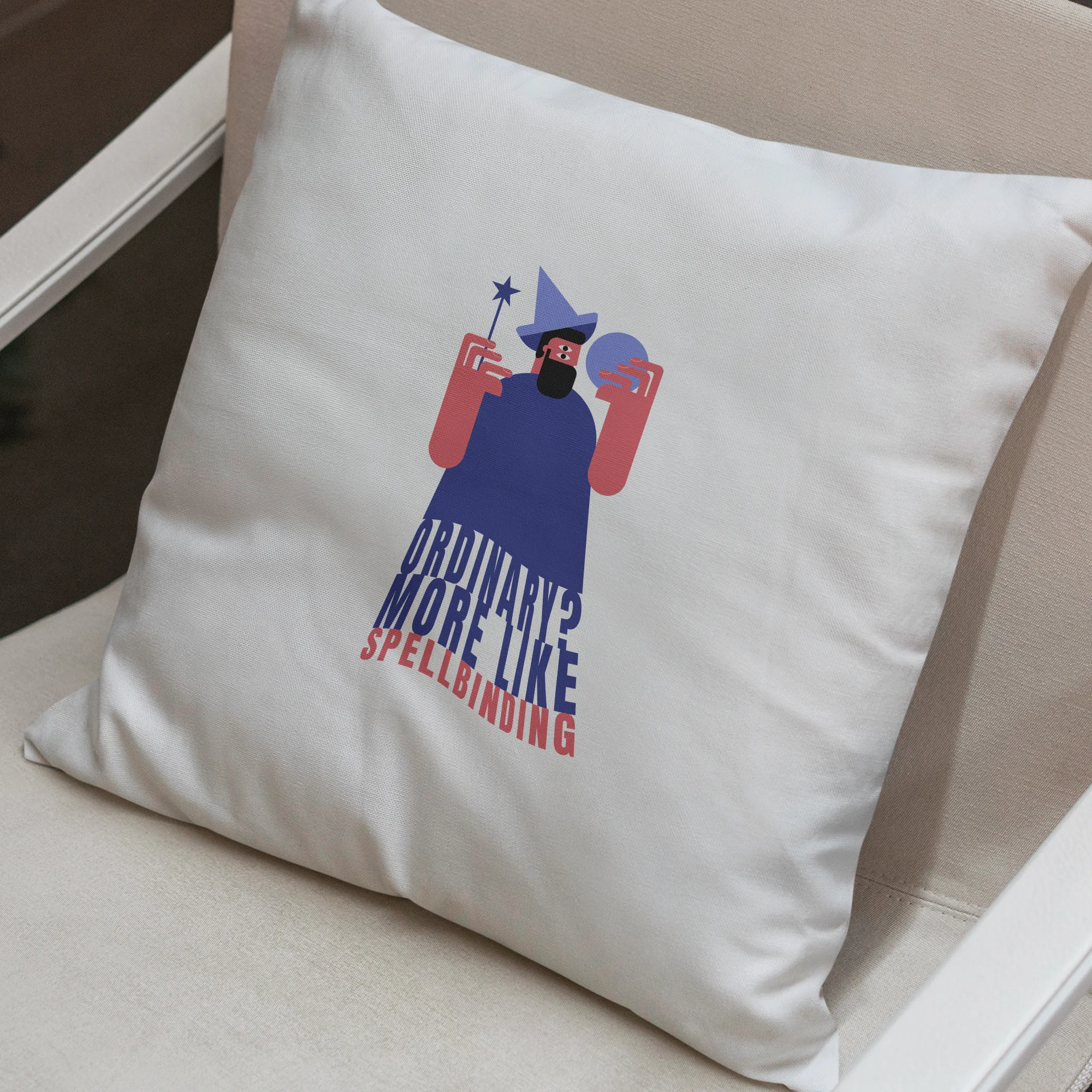
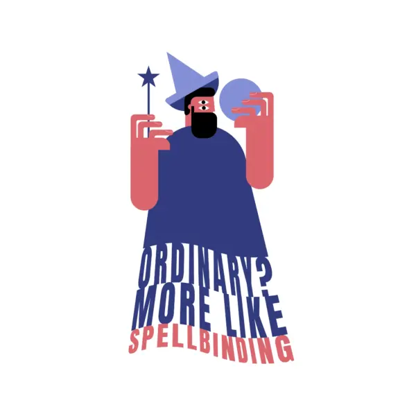
The design features a central object, which is a visually appealing depiction of a magician holding a magic wand. The style of the design is a combination of boy, children, geometric, illustrated, kids, minimalist, quote, simple, and teenager. This means that the overall look of the design will be clean and simplistic, with a focus on geometric shapes and illustrations that appeal to children and teenagers.
The color scheme of the design consists of orange, blue, and black. These colors will be used strategically to create a visually striking and harmonious composition. Orange and blue will add vibrancy and energy, while black will provide contrast and sophistication.
The chosen font for the text in this design is bold and sans serif. This font choice will ensure legibility and a modern, clean look. The text featured in the design is the quote “Ordinary? more like spellbinding.” This text will be placed strategically within the design, complementing the main object and enhancing the overall message of enchantment and magic.
