When we talk about music, a world of possibilities, tastes, and related themes opens up. With millions of genres, there are countless characters, styles, fashions, and more, allowing for the creation of thousands of designs centered around this theme.
Various factors make creating T-shirt designs about music an easy strategy to reach different audiences of all ages and genders. Besides its great popularity and frequent trends, music establishes a direct connection with the artist or band creating this art, leading to the formation of social groups known as “fans.”
These designs create a sense of community and belonging. People with similar tastes and passions can easily identify with each other. Wearing a t-shirt featuring a band or singer not only demonstrates admiration for the artist or musical taste, but it also reflects one’s worldview (Anthony Infusini).
Next, we will discuss what a T-shirt with this theme needs to become popular in the market, as well as the types of illustrations we might see based on the musical genre we want to design for. Here, passion and graphic elements combine to form a design that stands out among the millions we see on various platforms.
What Should You Consider When Creating a Music T-Shirt Design?
Created with ByPeople Composer
Before discussing design, it’s important to note that beyond creating something visually appealing, you are marketing and creating to strengthen the identity of a brand. In this case, it’s the social perception of the artist or band. The graphic elements, phrases, decorations, and other details must align with the existing essence without altering it.
This is why it’s essential to first understand the genre for which the design will be created. From there, you can decide if there will be a main character and the different techniques to be used in the illustration.
It is often thought that these types of designs have no impact, but according to a recent report by atVenue, merchandise sales in 2022 increased by more than 40% compared to 2019. Top-tier artists can earn up to a quarter of a million dollars per show solely from merchandise sales, while even smaller acts can make $5,000 per night selling t-shirts and hats (Elsie Roy).
In other words, these types of designs are a strategy and a way to reach large audiences and achieve good sales.
Now, let’s talk about the graphic elements these designs include.
Graphic Elements of Music T-Shirt Designs
General Music Themes
As we mentioned earlier, genres are an important factor, but there are also other themes used in these elements.
Musical instruments like guitars, pianos, drums, violins, and saxophones are classics in this type of theme. An example of this can be seen in the design “A Woman’s Hand Playing a Symphony.” This design features a captivating artwork of a woman’s hand gracefully playing a symphony on her piano. The illustration is beautifully rendered, showcasing the talent and passion of music. The design is specifically aimed at a teenage audience, with a youthful and vibrant atmosphere.
Another theme we often see in these designs is musical notation, including the treble clef, bass clef, musical notes, and staff lines. Representations of sound waves and speakers also frequently accompany the designs as graphic elements.
Regarding phrases, we almost always see references to song lyrics or quotes from the artist or band.
Artistic Styles
Created with ByPeople Composer
Just as we see different music genres for the design, the artistic style to be used is also chosen based on this. Why is this important? As mentioned at the beginning, aesthetics play a fundamental role here. A rock band would be more suited to a vintage style, including typography, color schemes, and other elements, rather than a more modern theme. The most common styles you can find are as follows:
- Abstract: Geometric shapes, splashes of color, abstract patterns.
- Vintage/Retro: Retro fonts, old-school microphones, vinyl records.
- Minimalist: Simple lines, monochromatic schemes, subtle designs.
Geometric shapes, color splashes, and abstract patterns are often used in designs for disco or electronic music-themed shirts. For example, the “Boy Dancing in the Disco” design combines various shapes to form a person, with additional elements around them that create the feeling of dancing.
In vintage style, we see retro fonts, microphones, and vinyl records. This is exemplified by the “Man Singing with a Microphone” design. It features a man singing into a microphone, decorated with a black-and-white collage design. The overall aesthetic is colorful and distressed, with an illustrated style. The design is aimed at men and music, specifically targeting teenagers.
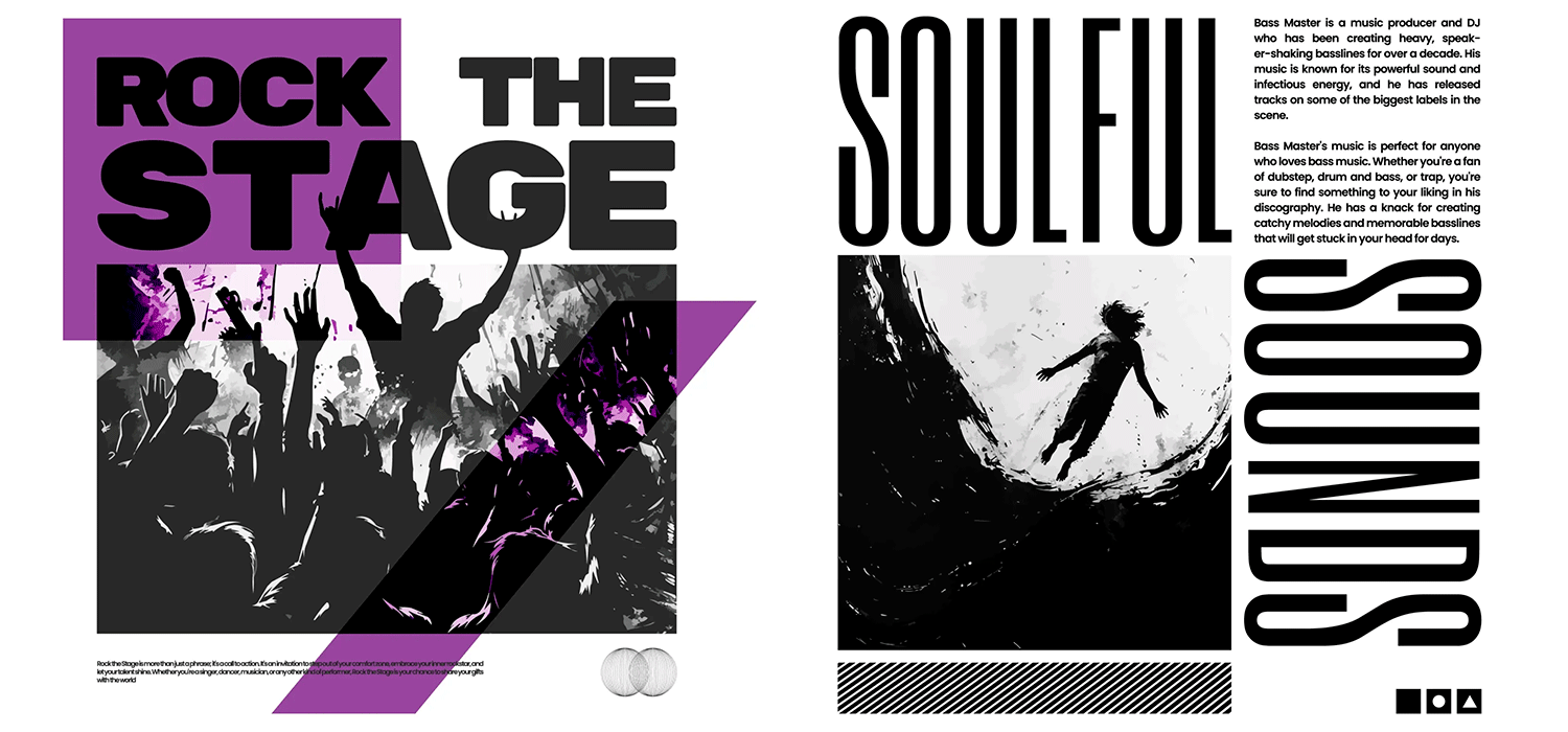
Lastly, the minimalist design features simple lines, monochromatic scenes, and small designs. An example is the “Lost Soul Silhouette in Music” design, which uses black and white colors with silhouettes. The design features a worn, illustrated silhouette of a lost soul with a musical theme. The silhouette is in black and white, using primarily black, gray, and beige. The style is artistic and stencil-like, targeting teenagers or musicians. The design is striking, with the text “Lost in the Music” adding to the overall aesthetic.
Custom and Personalized Elements
Each artist has their unique characteristics, making it difficult to define a general graphic line. Therefore, customized designs in this theme are essential. If you want to use graphic elements for a personalized music-themed t-shirt design, the most commonly used themes and graphic elements are as follows:
- Band/Artist Logos: Custom logos or artwork specific to a band or artist.
- Album Art: Incorporating elements from album covers.
- Tour Dates: Listing tour dates and cities.
- Fan Art: Artistic renditions created by fans.
This makes the designs more specific, which, although it requires extra work, also increases their value not only monetarily but also emotionally for the fans.
Techniques for Music T-Shirts
Each t-shirt should be unique and utilize a specific technique. Not all designs need to be illustrated; they can also be printed or feature images.
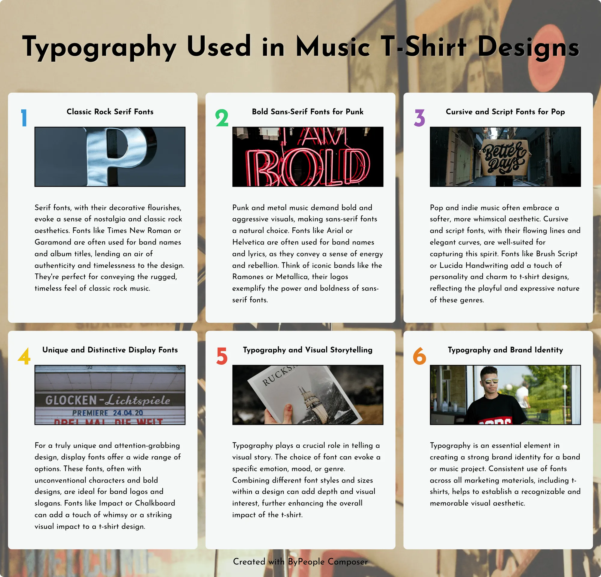
In typography, we can find stylish fonts and creative text. Here is a poster where they are explained.
Created with ByPeople Composer
In illustrations, we can find hand-drawn designs, caricatures, and sketches. One of the most popular techniques is fan art, which is created by hand and then digitized using various platforms. A study by Spotify demonstrates the importance of the relationship between fans, t-shirts, and design, investigating the relevance of merchandise in fan communities and its impact on artist engagement.
The study found that there is a high sale of music-themed t-shirts, with sales peaking in August, 17.2% higher than in other months of the year. This merchandise is the most popular because it is collectible and more affordable than vinyl records or other items.
Finally, another technique for these designs is photo manipulation of the artists, whether from regular photo shoots, concerts, or collages, often created by fans.
An example of this is the t-shirts we’ve seen of Taylor Swift, which feature official tour photos from “The Eras Tour.” These are not illustrations or fan art but actual images. You’ve likely seen them around the world, as this theme in the music world is currently very popular.
In addition to Taylor Swift, we can also see other iconic artists such as those listed here:
Created with ByPeople Composer
Illustrations According to Different Music Genres
Illustrations for Hip-Hop
Hip-hop has always been known for leading the way and being the center of attention in urban culture. Hip-hop illustrations often feature street art, iconic singers, and famous song lyrics. On our website, we have various hip-hop designs suitable for any occasion or as merchandise.
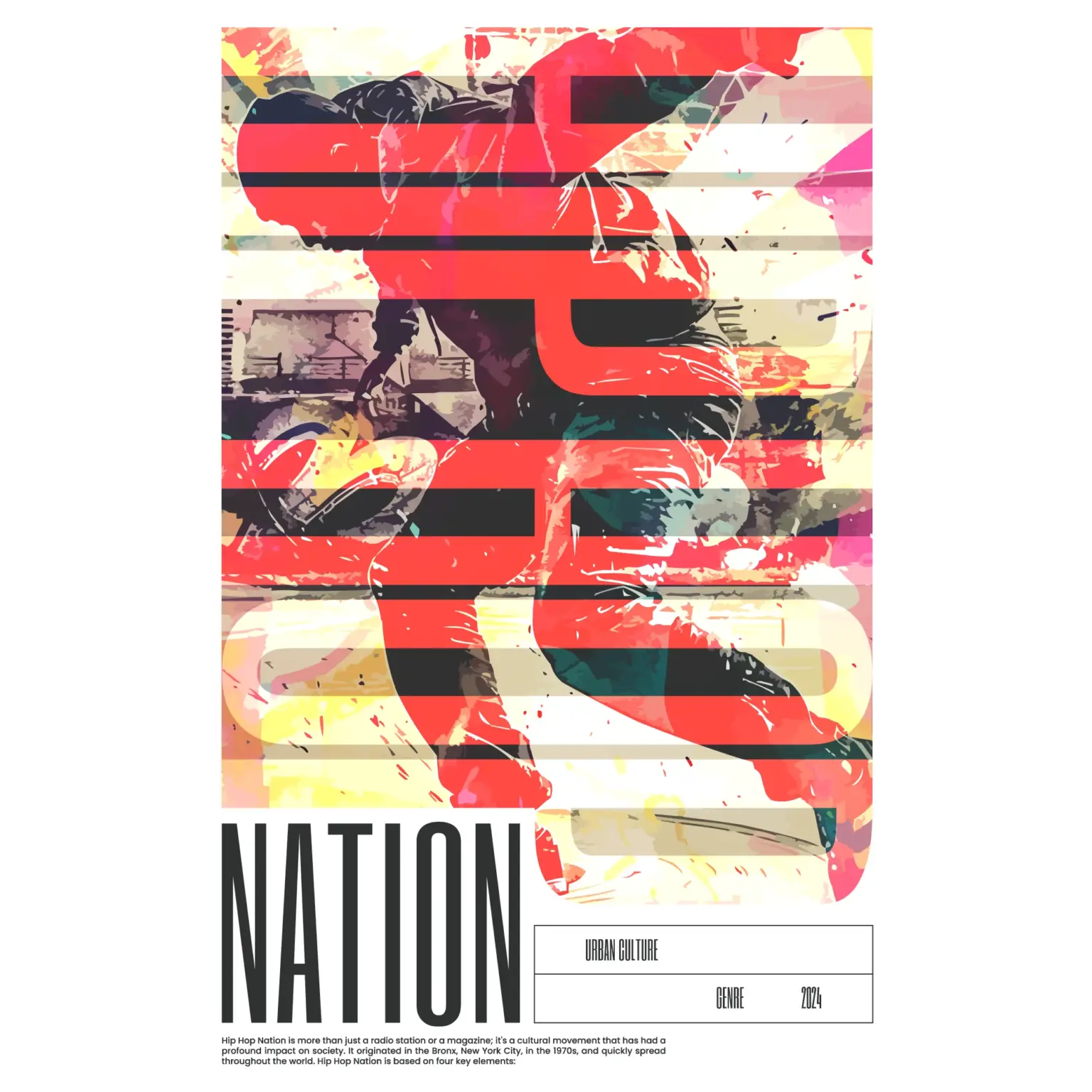
This design, “Boy Dancing Break Dance with Hip-Hop,” features a teenage boy breakdancing in a dynamic and energetic pose against a vibrant background of red, yellow, and brown. The overall aesthetic is grunge and streetwear style, with a worn, illustrated look. The bold and striking title “Hip Hop Nation” uses display fonts. This design perfectly captures the essence of hip-hop culture and is sure to attract fans of urban art and street fashion.
Illustrations for Rock Fans
In rock illustrations, the vintage style is essential. Bands take center stage, and when combined with musical instruments, they create a great mix. Typography is fundamental here.
Commonly, we see gothic/blackletter fonts, heavy serif fonts, and graffiti-style fonts, among others. An example of this can be seen in the t-shirt design “Baby Phrase with Metal Styling,” perfect for children or adults, featuring the word “metal” in this type of lettering.
The design features a metallic-style badge prominently displaying the word “Baby” in a bold, grunge, or slab serif font. The overall style is simple and illustrated, suitable for children and babies. The color scheme is primarily black and gray, with a black-and-white option available.
Another type of illustration for rock is selecting the logos and typography used by bands. Here are some examples:
Iron Maiden: Fuente “Metal Lord“.
AC/DC: Fuente “Squealer“.
Metallica: Fuente “Pastor of Muppets“.
Guns N’ Roses: Fuente “Guns N’ Roses“.
Nirvana: Fuente “Onyx“.
Illustrations for Pop Lovers
In pop, compared to rock, we see softer and more aesthetic designs with elements like flowers, musical notes, and more. Pop illustrations often feature phrases from the 70s and related icons.
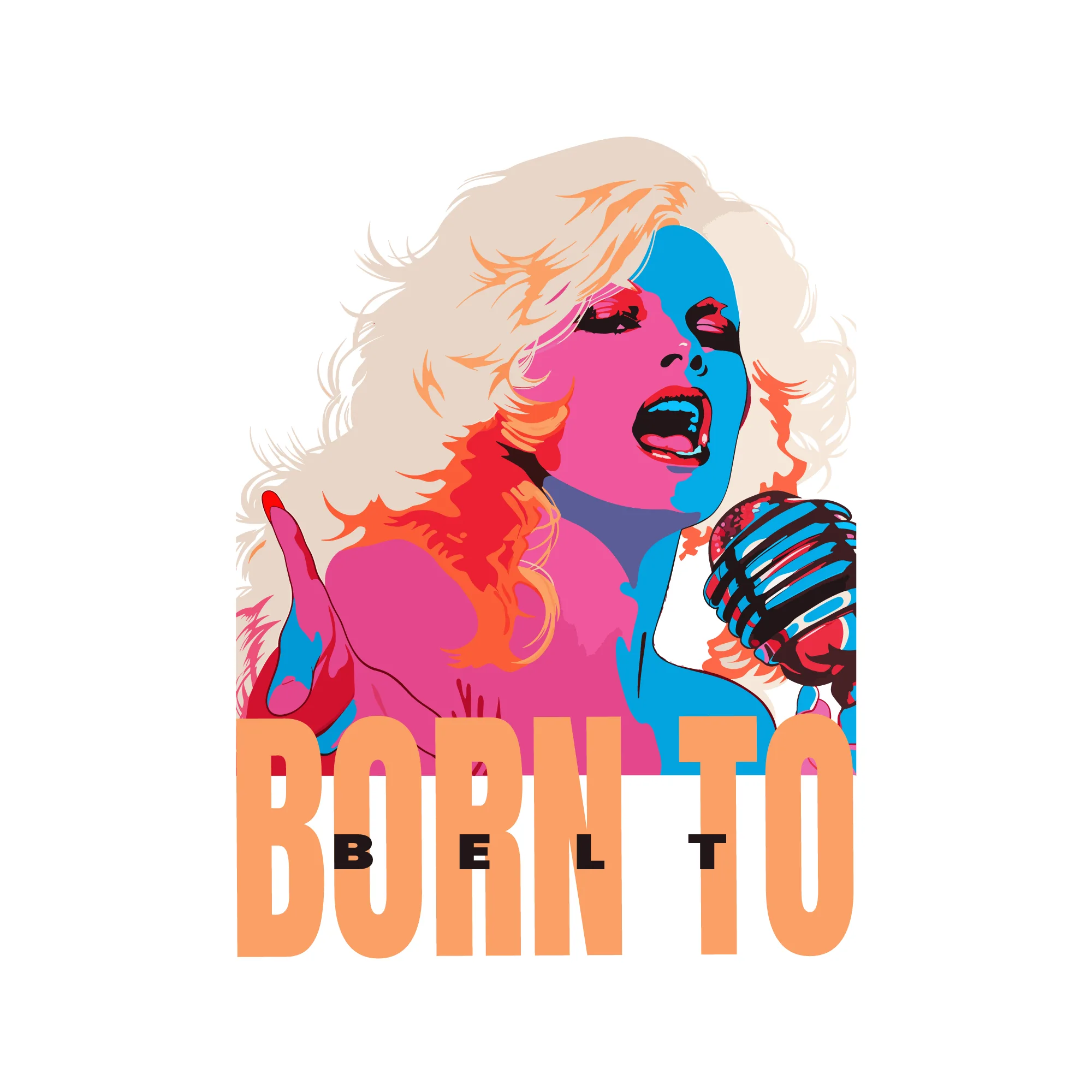
An example of this can be seen in this artwork with vibrant and eye-catching colors. The design shows an illustration of a girl holding a microphone, exuding passion and musicality. The girl is illustrated with intricate details, showcasing the talent and charisma of a musician. The design includes a musical phrase that adds depth and enhances the overall aesthetic.
The design style combines artistic expression and teen appeal, attracting music enthusiasts and young people. The artwork captures the essence of the girl, highlighting her musical talent.
A tip for illustrations in this genre is to use simplified and graphic shapes: The shapes and figures in pop illustrations are often simplified, with clean lines and clear, flat areas of color. This gives the illustrations a graphic quality, almost like cartoons.
Blues and Jazz Illustrations
For blues and jazz illustrations, we often see figures like Ella Fitzgerald, Louis Armstrong, Charlie Parker, and others. These illustrations are characterized by a cool color palette, frequently using shades of blue along with other cool and soft tones such as deep purples, blacks, and grays. This color palette helps evoke the emotional depth and poignant quality of blues and jazz.
In these types of illustrations, the style is often more abstract and stylized rather than realistic. One of the features of jazz and blues is to evoke emotions through the dancers or musicians depicted in the designs.
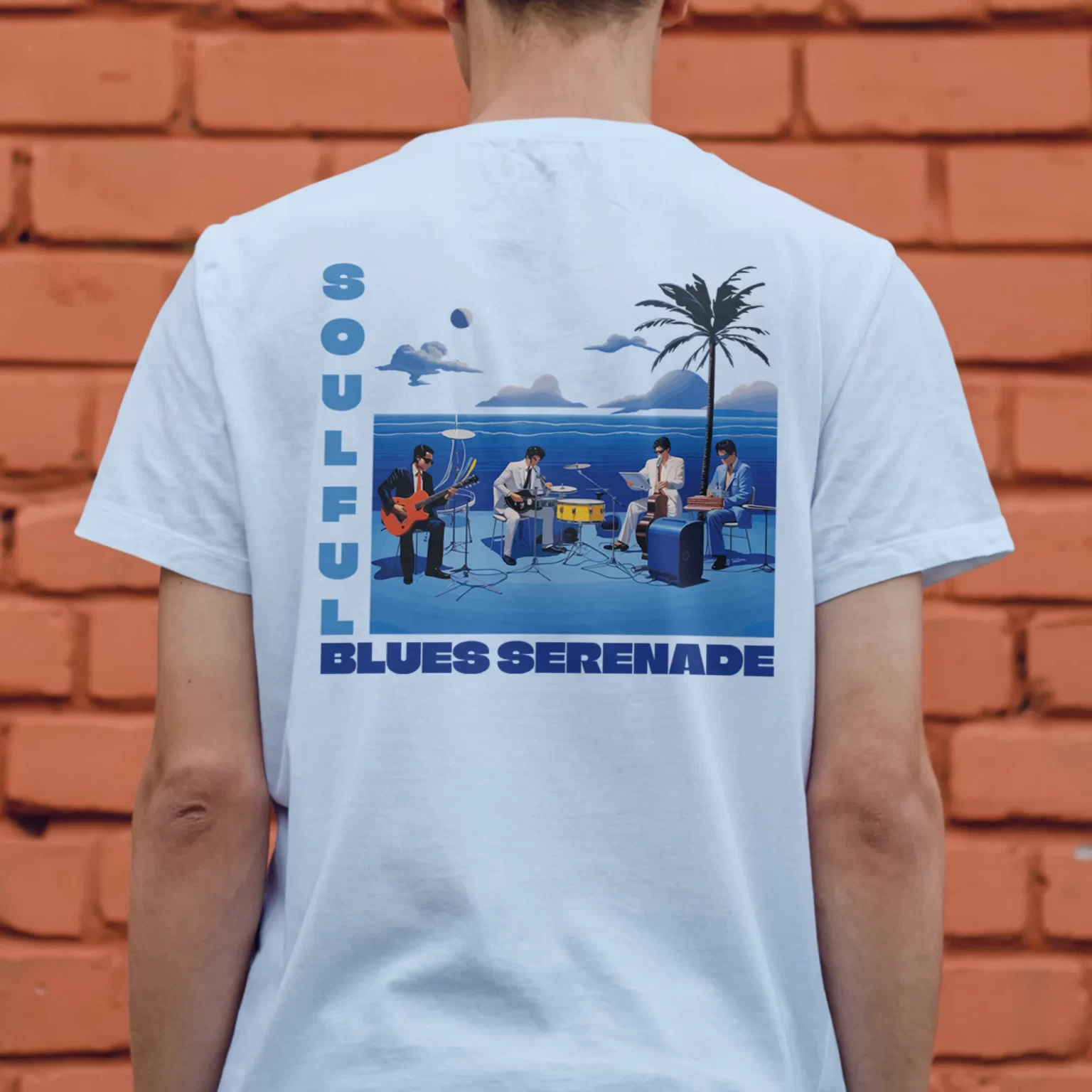
An example of this is a design featuring a group of singers gathered together, playing blues. The blue tones are characteristic of this type of illustration, and the typography is reminiscent of the era’s lyrics.
Many blues and jazz illustrations depict nighttime settings, such as dimly lit jazz clubs, urban landscapes, and moonlit streets. This reinforces the genre’s association with nighttime performances and late-night gatherings.
Dance Music Illustrations
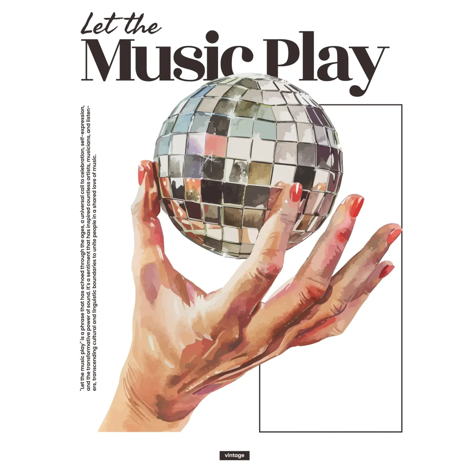
Illustrations representing dance music evoke the 70s and 80s with disco balls, people in era-appropriate clothing, and more.
In these illustrations, shadows play a vital role, as the goal is for the design to capture the movement generated by dancing. An example of this can be seen in the design shown at the beginning.
The design features a vintage-style illustration of a hand holding a disco ball, inspired by 80s music. It is aimed at men, musicians, teenagers, and those who love retro themes. The colors are in shades of gray, brown, and beige, giving it a nostalgic touch.
The bold slab serif font adds a touch of masculinity and strength. The text “Let the Music Play” reinforces the theme of music and celebration. Overall, this design captures the essence of 80s music in a stylish and timeless way.
In this context, we can understand that the relationship between music, genre, and design is closely intertwined, as there must be a consistent graphic line.
During concert season, music T-shirt designs are in high demand, as attendees want to wear clothing that references their favorite artist. To address this, we created designs suitable not only for adults but also for children, since some concerts are for the whole family, not just for adults.
When creating these designs, we aimed for versatility so that they could be worn on any occasion, not just at concerts.
Sometimes, we buy a T-shirt with a specific artist’s design, and even though we like it a lot, we don’t always want to advertise our preference for that artist. Therefore, we combined various features of music-themed designs to create a modern and fun collection that includes all the graphic elements we want to see.
To illustrate what I mean, we’ll show more than 10 designs that could be perfect for you if you’re looking for this type of illustration.
Music T-Shirt Designs For All
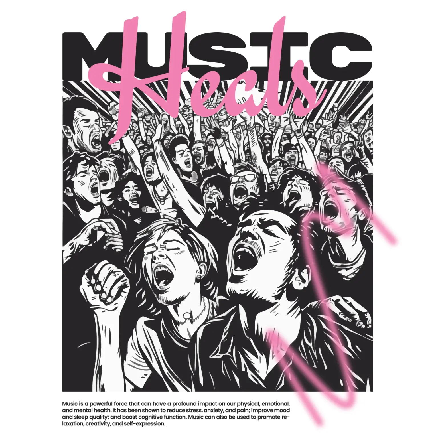
Audience Singing with Heart Design
The design features an illustration of an audience singing with a heart-themed design, targeting men and teenagers. It is in black and white with a distressed aesthetic. The colors used are black, white, and pink. The text “Music Hearts” is rendered in a handwritten or script font. The overall look is bold and artistic, perfect for music lovers and musicians.
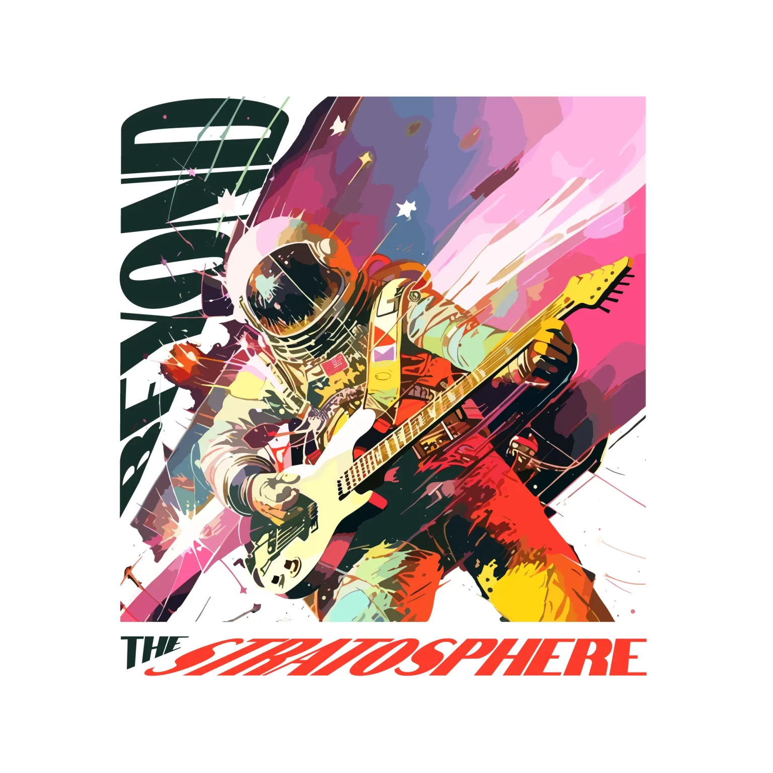
Rock Star Astronaut Design
This rock-themed astronaut is one of the most original and fun designs we considered, as it’s rare to see such a character with a rock guitar.
Vibrant colors like yellow, purple, and orange are characteristic of this design. The illustration is hand-drawn and then digitized, which adds extra value to the design since you’re unlikely to find it elsewhere. This makes it a great choice for both personal and commercial use.
Street Musicians Playing Music
This design depicts a vibrant and lively scene of street musicians performing. The main focus is a group of musicians, including a girl with a guitar, set in an urban environment. The illustration is colorful, capturing the energy and spirit of street music.
The colors used are orange and black, creating a striking contrast. These colors enhance the urban and bold style of the design.
The fonts are bold, sans-serif, and handwritten. The bold font highlights the text, while the sans-serif and handwritten styles add a creative and artistic touch.
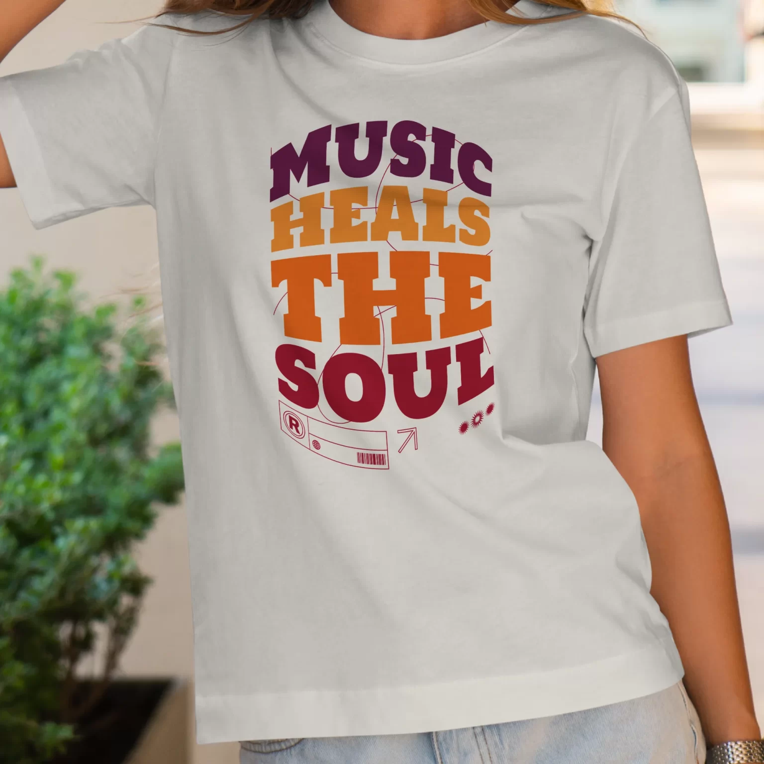
Musical Phrase in The Form of a Cylinder
The design features a central element, which is a musical phrase in the shape of a cylinder. The cylinder is decorated with a variety of colors, giving it a vibrant and eye-catching appearance. The style of the design is aesthetic, appealing to both children and teenagers. It incorporates colorful elements, making it perfect for younger audiences.
The design also includes linear elements, adding a touch of simplicity to the overall composition. It is suitable for both men and women who appreciate music and musicians.
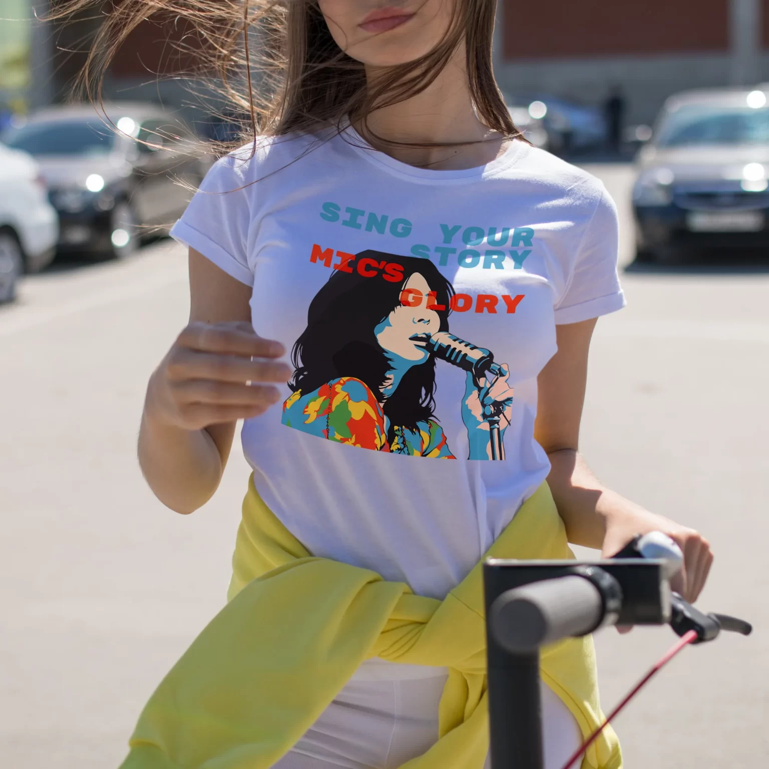
Girl Holding a Microphone While Singing
The design features a vibrant and dynamic depiction of a girl passionately singing while holding a microphone. The illustration is colorful, highlighting the girl’s energetic personality and her love for music. It captures the essence of a talented musician, with an emphasis on her role as a singer.
The overall style is illustrated and captures the essence of a young person expressing themselves through music. The use of bold, sans-serif fonts adds a modern touch to the design, creating an appealing visual contrast.
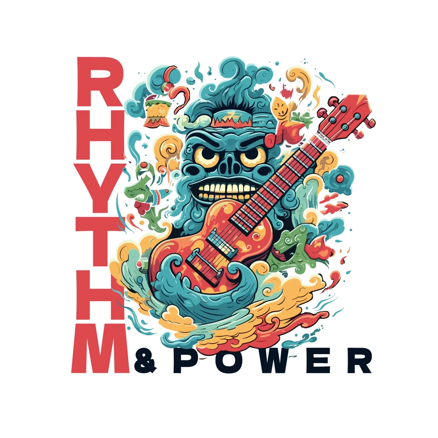
Wind-Wrapped Monster Playing
The design features a monster wrapped in wind playing the guitar as the central element. It combines elements of art, children, vibrant colors, guitars, illustrations, music, and teenagers to create a visually appealing and immersive design. The color scheme includes vibrant shades of red and blue, adding a lively and playful atmosphere.
The fonts used in the design are bold, sans-serif, and display typefaces, enhancing the impact and readability of the text.
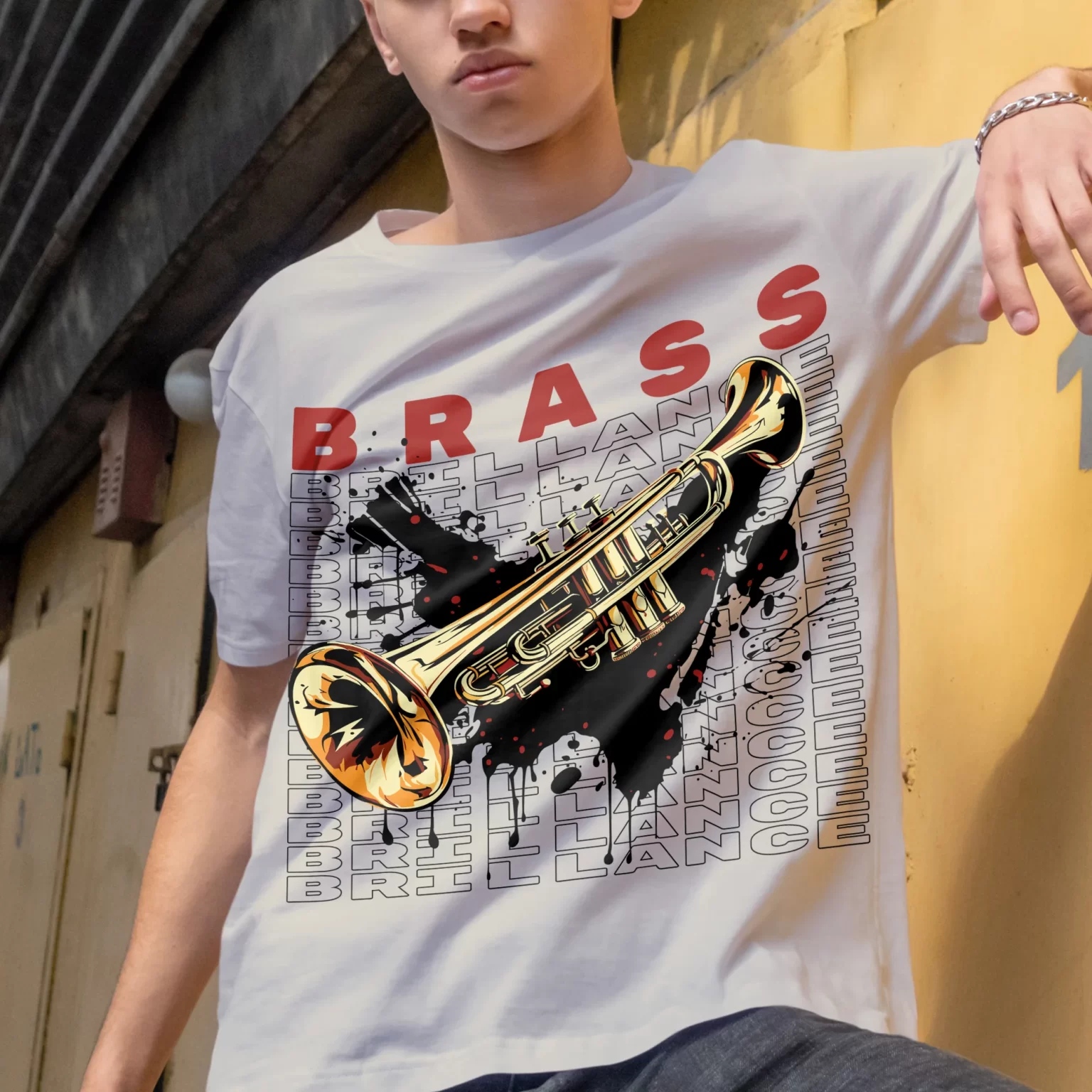
Shimmering Trumpet Accompanied by a Decorative Background
The design features a bright trumpet as the central element, with a radiant and captivating aura. It is accompanied by a decorative phrase in the background that adds an artistic touch to the overall composition. The art style gives the design a unique and visually appealing appearance.
The color scheme is predominantly black, which adds sophistication and elegance to the design. Red accents are used to create striking highlights, adding a touch of vitality.
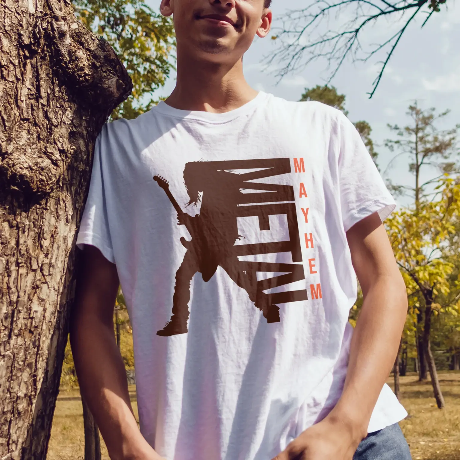
Guitarist Metal Silhouette Design
The design features the silhouette of a guitarist playing an electric guitar, with a focus on both the guitar and the musician. Illustrated in a simple, stencil-like style, it is ideal for teenagers or music enthusiasts. The color scheme includes bold shades of orange and brown, which enhance the design’s bold and rebellious style. The text “Mayhem Metal” is rendered in an elegant sans-serif font, completing the modern and dynamic look of the design.
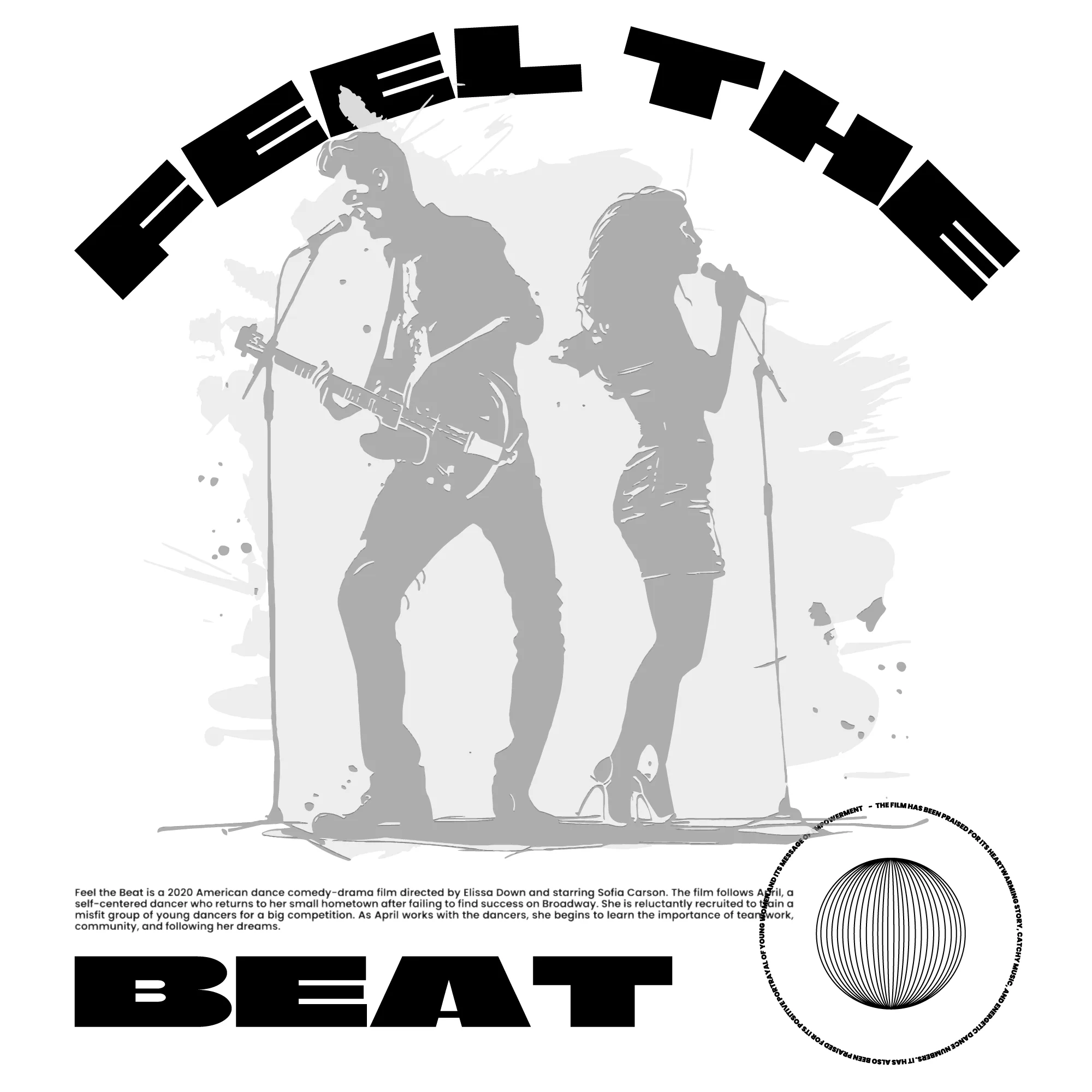
Couple Music Silhouette Design
The design features a black-and-white silhouette of a couple playing music, with a grunge and distressed style. The main focus is on the couple, with one person playing the guitar. Illustrated in a stencil-like manner, it is ideal for teenagers or music enthusiasts. The colors used are white, black, and gray, giving it a classic and timeless look. The fonts are bold and display-type, with the text “Feel the Beat” enhancing the artistic touch of the design.
Hands Touching a Guitar Decorated with a Music Phrase
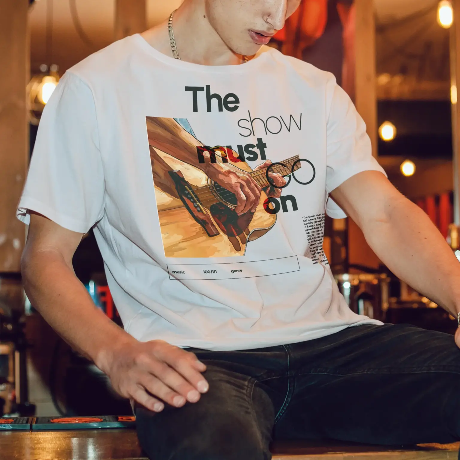
This design features hands playing a guitar, decorated with a musical phrase design. The overall style is aesthetic and illustrated, making it ideal for music lovers and musicians. The design is simple yet striking, suitable for teenagers and women. The color scheme includes black and burgundy, adding a touch of sophistication. The text “The Show Must Go On” is in an elegant sans-serif font, complementing the overall aesthetic of the design.
We conclude this article with these designs, which will always have something that sets them apart. We hope you found these tips helpful for identifying or creating a good design. Remember, our designs are ready for print and are perfect for merchandise, t-shirts, and any other items you might have in mind.
